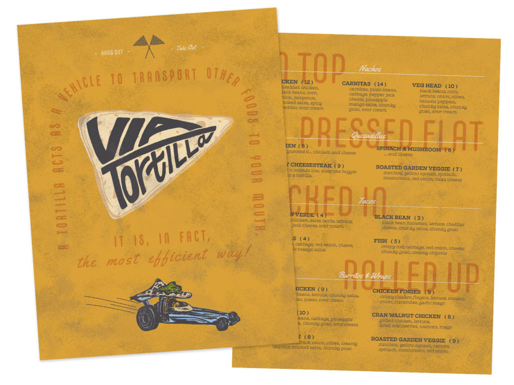
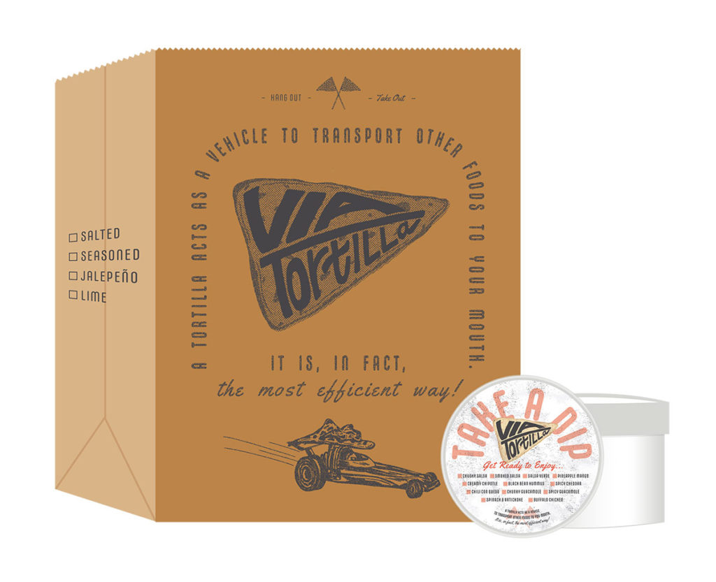
A design concept for a casual, laid-back gathering space with a tortilla based menu.
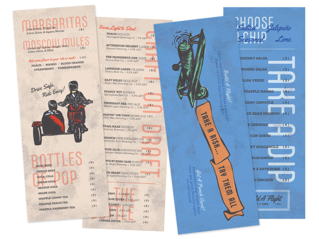
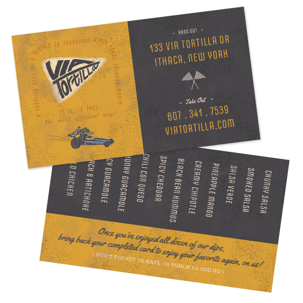
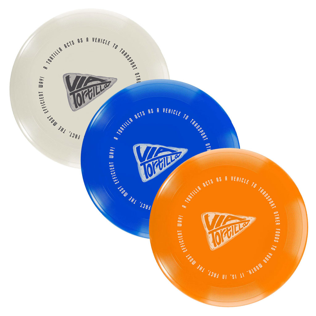
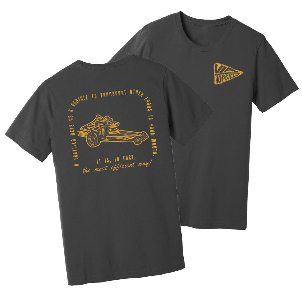
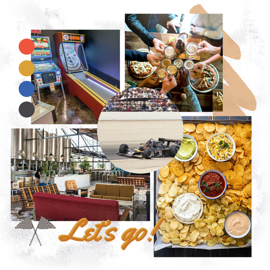
This idea originated with a friend’s drunken yet inspiring statement while eating a chicken wrap at 3AM that a tortilla is just a food that transports other foods to your mouth. I altered that into an all-telling slogan and expanded on a brand based on vintage racecars, with a menu based on tortillas. The triangle is a common shape that marries these concepts, representing both racing flags and tortilla chips. The handletterd logotype is also designed in a triangular shape and conveys movement forward, mimicking an arrow. The hypothetical phsyical restuarant space is inspired by craft breweries’ casual, slow-paced atmosphere that encourages customers to just hang out. This led to developing three menus that could be presented together or stand alone depending on the customer’s intentions – meals, chips & dips, and drinks. The playful, casualness of the brand is even carried over to how the food would be served on upside down frisbee plates!