

"Knitting Decoded" Editorial Spreads
page layout
An engaging opening spread and step-by-step story for a how-to magazine.
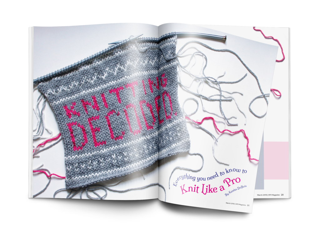
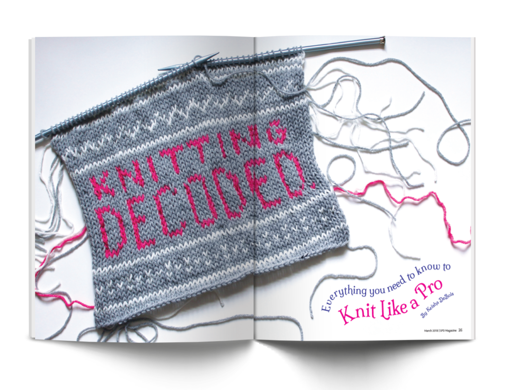
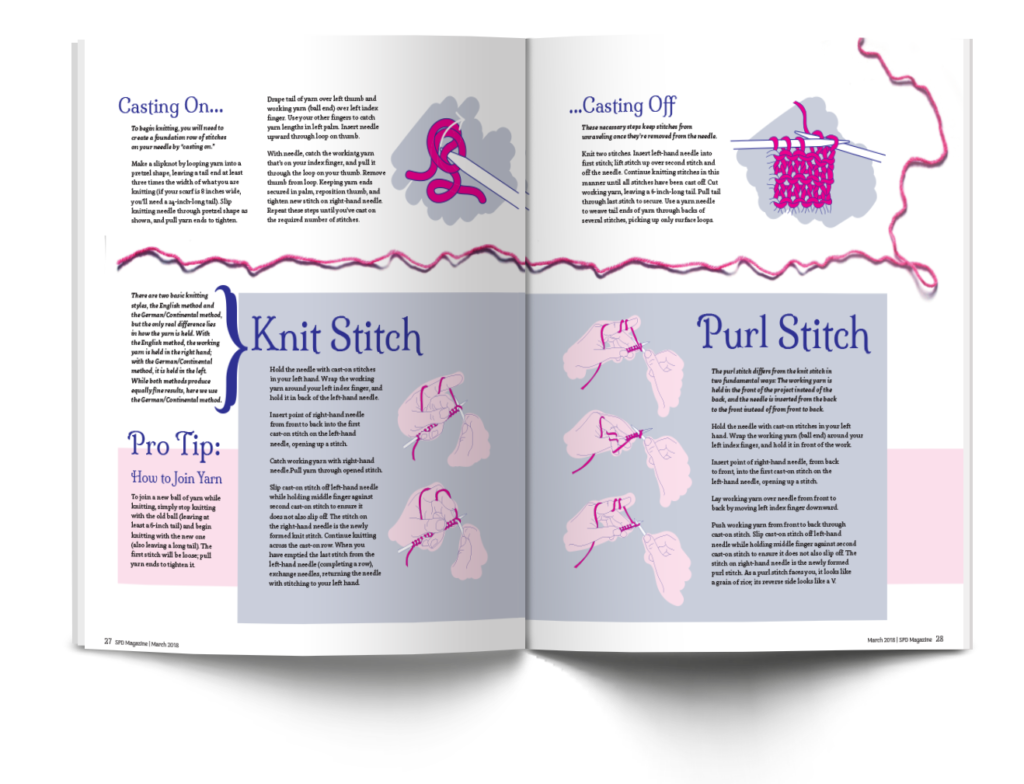
For a tutorial on how to knit, I used my own knowledge and actually knit out the typography for the title of the article. I used this photograph for the opening spread, creating an engaging and fitting visual. I placed the deck text in a way that mimicked the strands of yarn on the page, and found a typeface that has detailed serifs to visually mimick the stitches. The second spread provides step by step instructions on the two main stitches with accompanying illustrations.
